Blog
5/15/2024
I’ve actually been doing poster designs for close to 10 years now. It’s how I discovered my passion for design. It’s also how my wife talked me into going back to school. I was leaps and bounds ahead of my peers because of it too, but I had a bunch to learn to stay ahead once some of them caught up.
1. My first poster that I did for this company. I was just excited that he was cool with the idea of me designing a poster based off of a game that I was really into at the moment. I used Photoshop Elements to design this on an old slow laptop
2. I had more posters under my belt and I wanted to show off that I had improved. I got to put a “big name” on this poster. That guy was one of the inspirations for me getting into pro wrestling, so it was an honor to put him on there.
3. I stopped making posters for a little while, but the guy liked me and wanted me to design a third one. My sister, who is a teacher, let me borrow her computer with a 10″ screen and free Photoshop subscription through her school to make this. It was the first time I got to use real Photoshop! I remember waiting until the last minute to design this poster because the game series was adding another installment and I wanted to copy it. I was excited to add the old guy in the center because I actually took that picture. He was one of my dad’s favorites. I was so out of practice when making this poster that it’s not great. It’s pretty eye catching form far away, but close up it’s terrible.
4. There was a break in the years of this series because of COVID, but I had started school when I made this. I got a new laptop that was pretty powerful with a nice size screen, so it was much easier designing that poster. I remember thinking it was really good… it wasn’t. This is my least favorite poster that I have made ever. I had some new techniques but it was my first year of school and designing posters didn’t quite click yet.
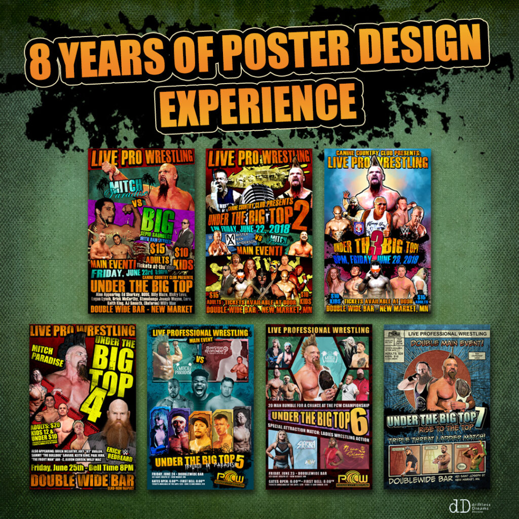
5. I made this during finals week while working two part time jobs. this is after it finally clicked for me. It was the most detailed posters I had designed and I used new techniques and honestly spent way too much time designing it.
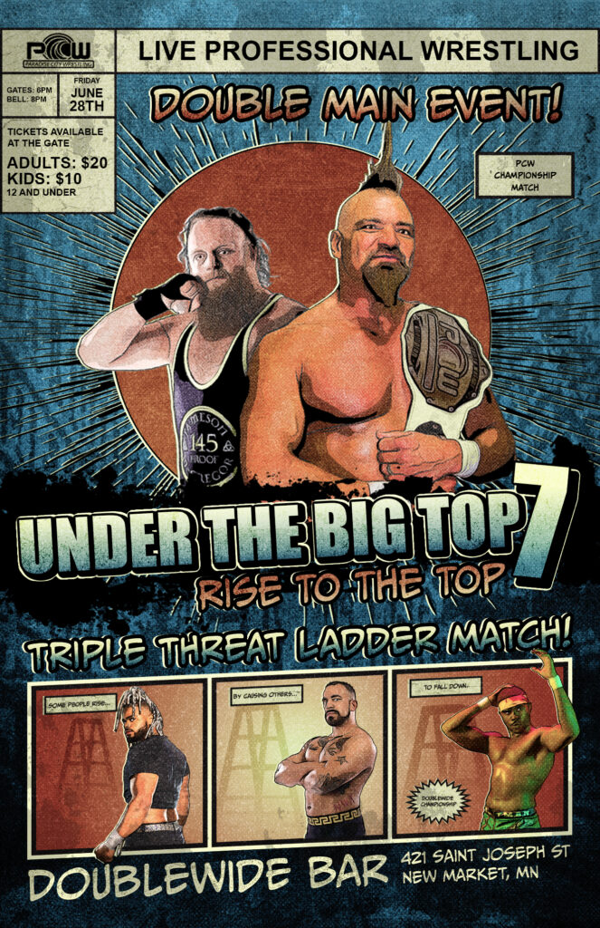
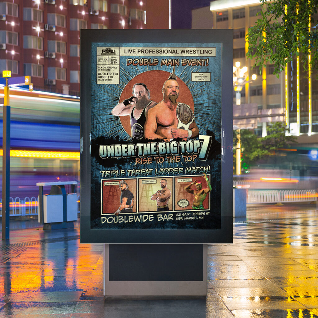
6. The idea of this poster kept changing because of the matches they were promoting were changing. I had the idea of making it look like a comic book. I feel like it was a good attempt but it didn’t lean far enough into the layout, composition, and style to really get my point across.
7. Honestly my favorite poster ever. I want to make more similar to it. I feel like it’s a very marketable look.
It’s always good to look back to see where you started and how far you have come. When I made the first poster in this series I felt like I was taken seriously as a designer. It’s funny to look back on my attitude about it now. Even though The most recent is the best I have made I know I can still improve as an artist and designer.
5/10/2024
I have been making a poster for this event every year for the last 8 years (we took a break for COVID) these posters have always been something that I took pride in and I’ve always looked forward to designing them. This one is no different!
The inspiration for every one of these posters was the video game series Borderlands. They use a really cool cell shading comic book look for their games and advertisements. Year after year I have made an attempt to make it feel like a comic book but I feel like I have fallen short until now. Using different filters, effects, layers, blending options and a little bit of the paint brush tool I have finally figured out how to take pictures from a camera and make them look drawn
I might have leaned in a little to far to the comic book look for it to feel like a Borderlands design but I am more than pleased with how this turned out. On linkedIn I called this my magnum opus. I may have figured out my “style” I might have to reach out to promote this look.
4/25/2024
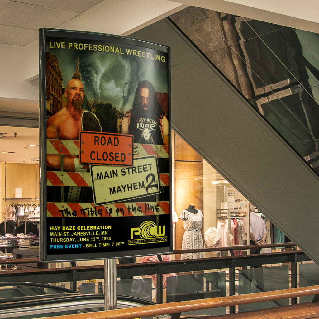
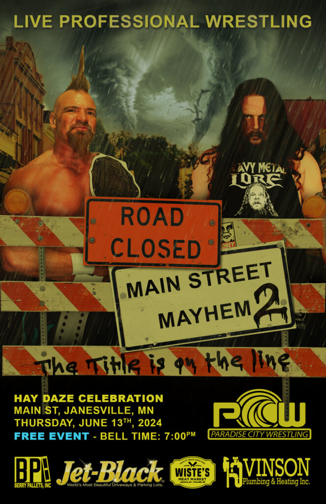
It’s fun to tell a story when making designs. Not only is this a continuation of the previous years theme but could you imagine two tornados colliding in your town!? That’s what it will be like when these two guys collide!
*Bonus detail* I designed the shirt that the guy is wearing.
3/26/2024
It’s always fun to play along with other Tik Tok users. This was a suggestion from someone that didn’t like how busy the back of package is. We only turn it over for one reason; to figure out how hot the oven needs to be and how long they need to be in there!
Youtube video link: https://www.youtube.com/shorts/LYzDTnR3opU
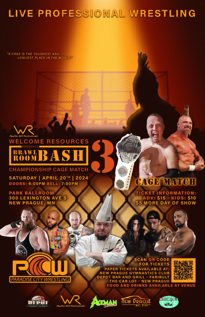
This was my third poster for this event. My other two designs I made for this event used silhouettes as a main focal point of the logo. When the company owner first told me of what the headline match would be I was excited for him! it was going to be inside a STEEL CAGE! It was going to be his companies first time with an important match type like this so I wanted to focus on that.
since it was their first time doing a match like this they we didn’t have any original photos to showcase on their poster. I decided to take displaying the visual of a steel cage into my own hands. I was able to manually build all of the assets needed to show the towering monstrosity in the center of a crowd. Keeping inline with the silhouette theme I established in the two previous posters I used a darker colors to let the viewer imagine what this show could look like if they were there without giving too much details away — the viewers imagination can do a great job of filling out the wonder of an event.
2/25/2024
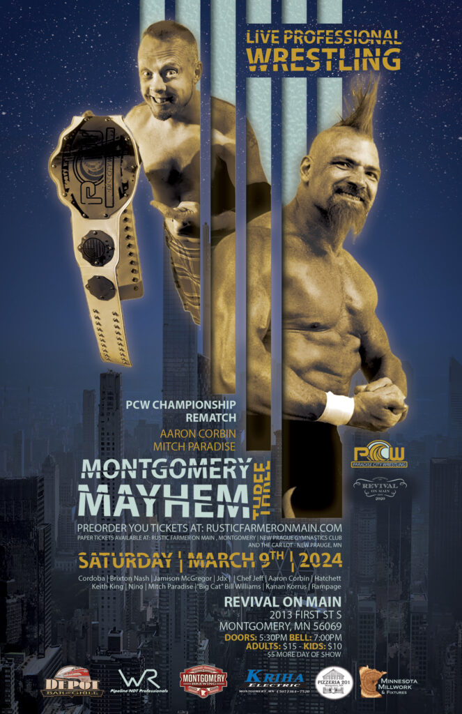
This was my third poster for this event. The previous year I drew inspiration from a the idea that I wanted to make it look like a movie poster. I used that same idea this for this poster. We got a new photo of the champion that looked a little goofy. the high angle it was taken at and his silly grin made me think of an action comedy movie.
I used long parallel bars to frame in the two competitors with the idea that i could use them as leading lines to draw the viewers eye down to the important details about the show. I also used contrasting colors and tones to draw the eye to the things that are the most important parts of this poster. What kind of event it is, the competitors, and when it is.
one thing that I really like about this poster is that my peers that also get to design professional wrestling posters (myself included in this) usually are forced to put so many performers on the poster creating what I like to call “the group of guys poster”. A lesson you learn early in training to be a pro wrestler is “less is more”. This means that as a performer you should let the things you use stand out. let people react and think about each move. If you throw everything you have at the audience they can’t appreciate the smaller things you do. Let your moves be impactful! That’s what we decided was best for this poster. I got to put just two guys on a poster and the event sold out!
2/3/2024
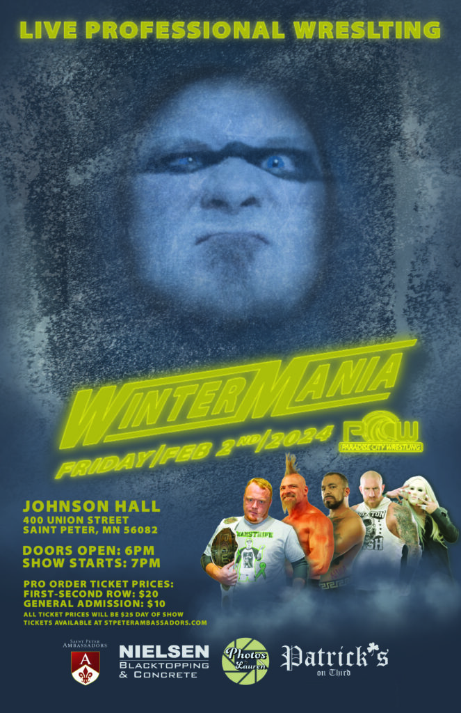
My unused poster. I was so excited about this poster. The way I get my inspirations for poster themes is after the show has a “Name” I like to think about how that show makes me feel. When the owner of the company told me the show was going to be called “Wintermania” I immediately thought about how cold that made me feel… like I was frozen.
At the time an old friend of mine recently started wrestling about 10 years after he had hung it up. He had some new posed photos taken. his face paint was always striking! His character was that of a made man, Horace The Psychopath. He would paint his whole face white and then put a black stripe across his eyes. It really drew attention to the emotions in his eyes. In the small group of professional wreslting fans he has quite a good cult following and I thought we could use that to our advantage to see if we could draw some of those wrrestling fans back by putting him in the center of attention of this poster.
I wanted it to appear that someone was frozen in an ice block but still conscious and plotting his next move. I wanted to use his string eyes to pull in the attention of a passer by. I used a bright color to to quickly convey the important information.
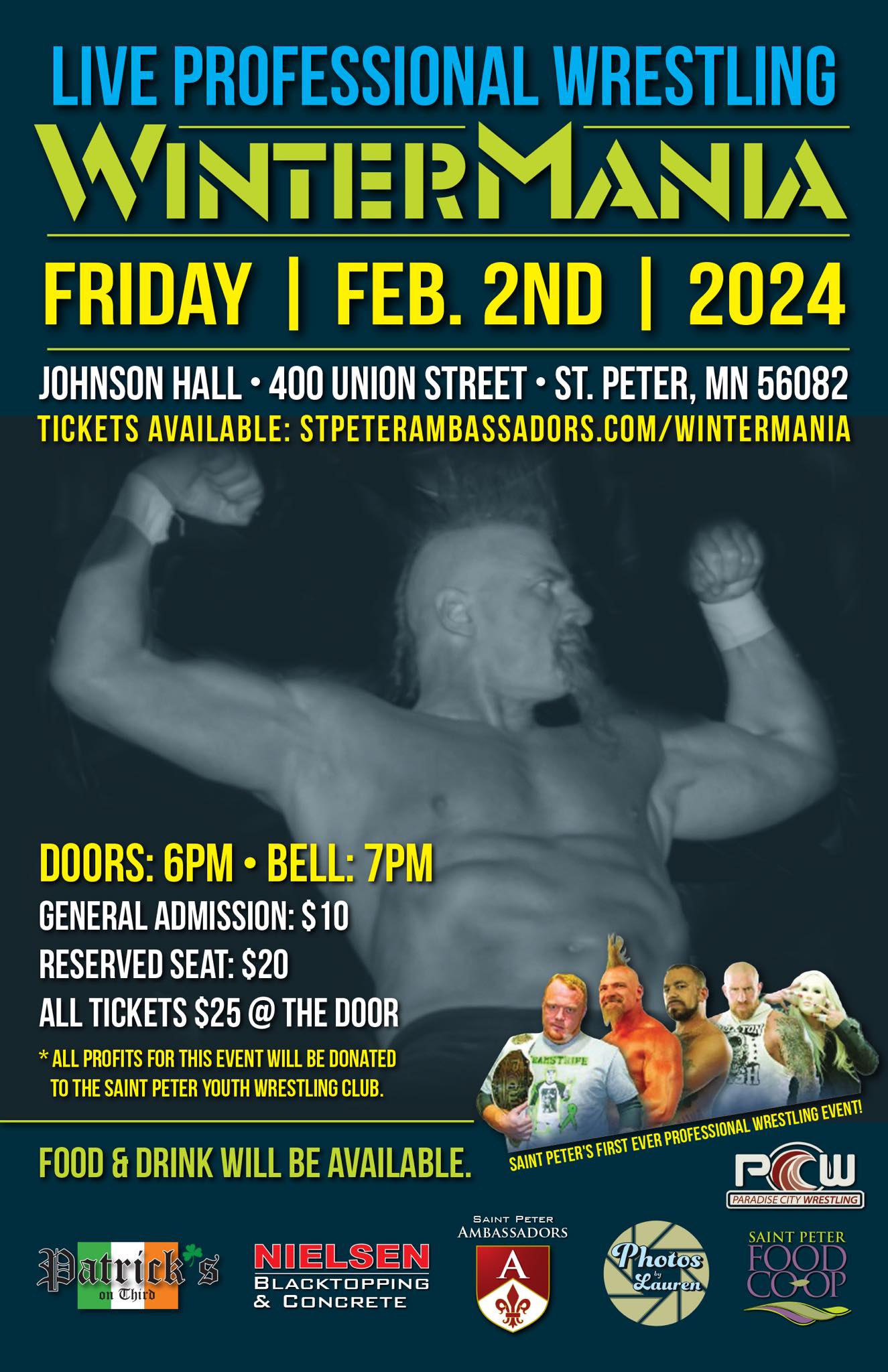
I'm not sure why this poster wasn't used. but I was told while I was designing this that the main group sponsoring this event was also making a poster to promote internally. I also know that Horace broke a rib pretty badly and decided ultimately that it wasn't a great idea to keep wrestling. A neat thing about the other person's poster design was they took inspiration from my design using similar colors, layouts, and creative ideas to make their poster. they even blatantly cropped out an entire part of my layout to use.

